Countdown to 1300 posts- one more to go
Gray scale value charts are also in any photographic store but they may be more inclusive, or perhaps just show the seven basic values- get whatever looks good to you. Here is one with the same 10 values as my little card- you may want to print it out so you can use it in some exercises if you don't have one on hand.
Compare the values represented to this pale atmospheric photograph of the sea:
Or this essentially dark valued road scape:
This photo has few middle range values but the high contrast between the murky background and light light road stripe and clouds unify the composition and make it dynamic.
Value isn't strictly limited to black and white, it is present in every color too, like this color value scale shows:(here value is called 'tone', and color is called 'hue'- it's the same thing, don't let it confuse you) Note how each value on the left matches the value across in the six rainbow colors. If you had a B&W snapshot of this chart, it SHOULD appear to just be a gray stripe across each value assignment, but in studying it I see that the darkest yellow is really closer to a value 4 than the one it's aligned with. In fact now that I look closely, I see that most of the colors are not where they should be on the gray scale! Some day it would be worth your while to make your own chart but be more careful about where the different colors align with their gray counterparts. I think the problem here is that the colors are all such high saturation that they have taken over from the grays they are supposed to match. Bad example, Bad chart!
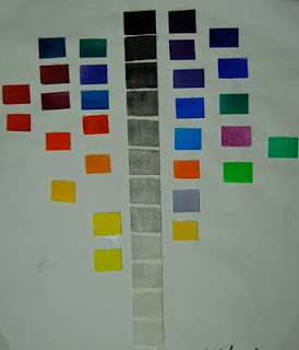
Here is a handmade chart from Kay Reynolds who was placing her watercolors in the various positions they would be on a gray scale:
To check it she put it in Photoshop and changed it to B&W- she did a pretty good job here. You might try this with snippets of fabric- just gluestick them in place when they are arranged properly. It's a nice reference to stick up on the wall to check where you are in a piece your'e working on.
TIP: look through a red gel (I buy a ten cent red acetate notebook cover at the office supply store and cut it into dollar sized rectangles to keep in my wallet and hand out. When you look through the red, the values all come into clear focus. OR you can go buy one of the really too expensive little thingies in the quilt shop to peer through with one eye.
That said, the brightest middle yellow will read as white in combination with other values. Yellow is a problem for so many people simply because of this- it jumps right out of any composition because of it's VALUE being so light. Even the darkest yellow reads light on the value scale.
Here are a series of anatomically correct face masks made by artist Ben Cuevas that demonstrate a few different value ranges in each-
There's an old saying that
COLOR GETS ALL THE CREDIT WHILE VALUE DOES ALL THE WORK,
and how true it is.
SO, that being said, I have a little assignment for you, yeah HOMEWORK! Walk around and look at your accumulated art materials- in my case here it's fabric for my quilts. Look at the whole stack of each color and what you will find is that you are sorely lacking in different values of each color! If you love blues, go there first and I bet you have continually bought the same similar-value blues. Do you have that inky blue-black, a range of indigos and navy into marine and wedgewood and baby blue and sky and ethereal barely blue? Or is your concentration basically in one or two values of blue? Check each color you can this way (use the red acetate to make this really easy and you don't have to squint so much!) and make a list of the values you are missing. When you shop keep these in mind as you build your palette of available values for your work.
(I once knew a woman who arranged her fabric simply by value alone! She realized that when she needed 'something' that it was a value change, not another piece of pink. I always thought this was an interesting way to keep fabrics but could never quite get on board this filing system. My 'system', which badly needs some cleaning out, is to pile like values together within a color framework. In other words, my orange piles range from pale peachy on down to rusty brown.)
Next assignment, go to your drawer of UFO's and pull out whatever is on top. You put it there because it just wasn't working, right? Get out the red acetate again and stand back from this piece- check the value movement across the piece and I BET you will discover what is missing right away, I BET a little value adjustment is just the ticket. Get those dark darks in there as well as the light lights! It will suddenly be what you had envisioned from the beginning. Yes it will. Stop arguing with me. If you don't believe me, send me a picture and I'll tell you what you're not seeing 'cause I'm that kinda gal. (But I'll do it nicely, I promise!)
Looks like tomorrow might be the big Thirteen Hundredth Post. My big plan won't be ready for a few more days so we will have to celebrate a different number post. Oh well. We'll do something tomorrow anyway, just am not quite sure which bridge to blow up...


3 comments :
I'll always remember and be thankful to Katie Pasquini who pulled up alongside me in her workshop and said - "ok, let's look at your fabric. Hmmmm... where are your mediums?"
Yup it was true, that moment when I realized I am by nature a high contrast sorta gal. She allowed to the class that she had this problem too, being drawn to real darks and real lights. To get her stash more balanced she made herself get a medium when she was getting a light or dark.
LOL - I did that for awhile and it's easier but it's not ever my first choice.
PS what are the little cut outs for on your first gray scale card?
To amswer Mary Beth's important query about what those little cutouts are o the first gray scale, they are to put over what you're trying to match so only a small potion shows. When you squint or use that red acetate it's easy to see which sample matches which gray. (This was a photo store find- the wee cutouts fit nicely over small sections of photo but it works just as well for fabric or other paper.) S
Post a Comment